Food Atlas
By Mak Hozo, Henna Shah, Stephanie Wong, Julio Sotelo
Introduction
The USDA’s Food Environment Atlas dataset includes many factors and variables that could impact the health of the population. Our objective was to explore different aspects of this dataset to see whether and how the variables influence two health response variables: the diabetes rate in a county and the obesity rate in a county.
Variables affecting obesity rates fell into three broad categories: census demographics, food availability, and wealth measures such as median income, poverty rate, and subsidies for free school lunch and SNAP. These variables were the most general and potentially easiest to control and track. Other discarded variables were highly correlated, or not correlated at all. Some of the variables were also the same data taken in different years; we chose to use the variables closest to the 2010 census data. Through looking at this smaller subset of data, we can extract useful information and patterns from the USDA data and better understand how access to food varies throughout the country.
As part of our initial exploration of the dataset, we investigated the relationship between various demographic variables and the obesity rate in a given county through a series of scatterplots and boxplots. There are three types of demographic variables in the dataset: those that describe the ethnic makeup of a county; those that describe the age distribution in a county; and those that describe the economic situation in a county in terms of median income and government supported food assistance and programs.
Non-Technical Summary
Many factors in our environment can influence the quality and choice of our diet. Our analysis from the Food Atlas dataset reviewed the relationships between these factors through multiple techniques to determine which variables are related to each other, which variables can best predict future values, and which geographical regions can be clustered together based on these variables in the food atlas data set.
Variable selection
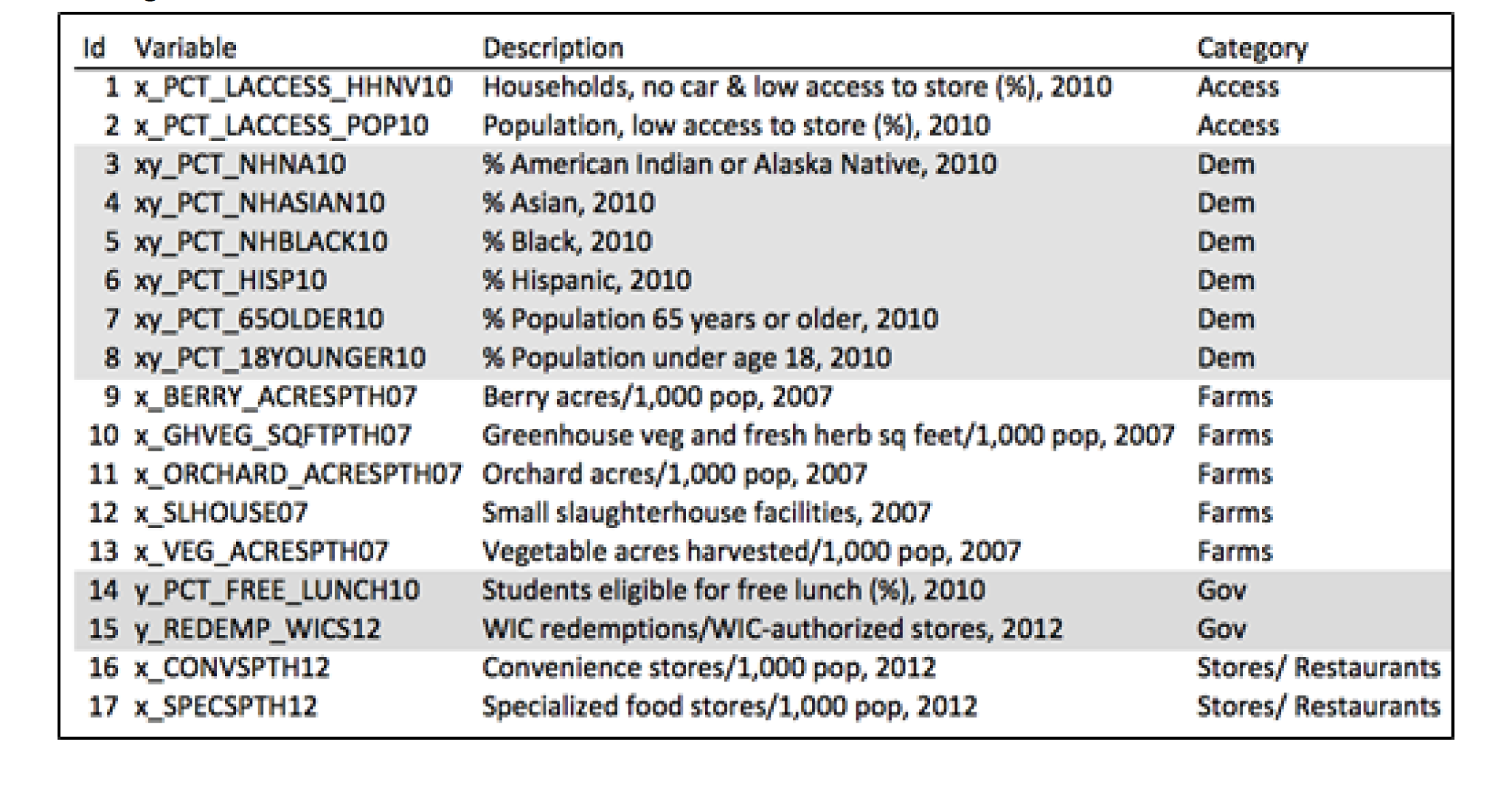
We know that there is some relationship amongst the variables. If food prices for good quality food are high, then it could be difficult for a low income family to purchase this food. And if these families do not have access to quality food their health could be compromised. We may also think that having more access to a supermarket than to fast-food restaurants could make US families healthier. Then maybe we have found groups of variables within the dataset that help describe different phenomenas such as obesity or diabetes. We started our analysis by finding some variables that may have bigger relevance than others within each group. By analyzing each category in the data we selected 17 variables that would be tested for significance to predict obesity and diabetes rates within the US.
Regression Analysis – Adult Diabetes Rate and Obesity Rate
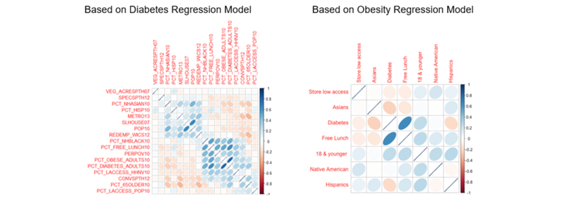
We used the technique of linear regression to analyze adult obesity rate and diabetes rate amongst counties in US. In terms of demographics, our findings show that counties with high percent of Asians and Hispanics tend to have lower adult obesity and diabetes rates. We see this relationship in the correlation plots below, where the blue colored ellipses indicate positive correlation and the red colored ellipses indicate inverse correlation. The width (size) of the circle show the strength of the correlation, where the narrower the shape is, the stronger the correlation between the two variables.
Additionally, counties that have a high percentage of Black population, are persistently poor counties, have a high percentage of household with no car and low access to stores tend to have higher diabetes rate. In terms of age, we see that counties with larger percentage of population over 65 years show higher adult diabetes rate. In practical regards, this makes sense, as you would mostly see the elderly with high diabetes rate. Our analysis also shows that counties with larger population under 18 years of age have higher adult obesity rates. In addition, counties with higher percent of students who are eligible for free lunch have higher percent of both – Obesity and Diabetes rate.
When we look at the inverse relationship, we see that counties with higher percent of Asian and Hispanic population show lower adult obesity and diabetes rates. Also, counties that are metro or those that have higher number of small slaughterhouses, specialized food store and higher number of vegetables acres harvested for sale have lower adult diabetes rate.
Canonical correlation analysis groups together two sets of variables that are the most correlated. Through our analysis, we determined that if a county has more convenience stores, more households with low access to food and no vehicle, fewer full service and fast food restaurants, fewer specialty stores, and fewer local farms, the county also tends to have a higher diabetes and adult obesity rate, and fewer recreational facilities. That is, having low access to healthy food options leads to worse overall adult health. However a county with high access to food in general and more fast food restaurants is likely to have higher child obesity rates and more recreational facilities. A county or state policy-maker may use this as an incentive to want to increase access to healthy food options, as that may lower diabetes and hopefully obesity rates in their counties.
Linear discriminant analysis is able to put counties into classifications based on how different they are from each other; in this analysis we specifically looked at the classification of whether or not a county consistently had a poverty rate of at least 20 percent from 1980 through 2011. However, even the best possible classification model we could create from a portion of the data, wrongly predicted 80% of the persistent-poverty counties, with similar results on a ‘metro’ binary variable. Because of this, we decided not to investigate this type of analysis much further for our categorical variables.
Clustering – Obesity Rates
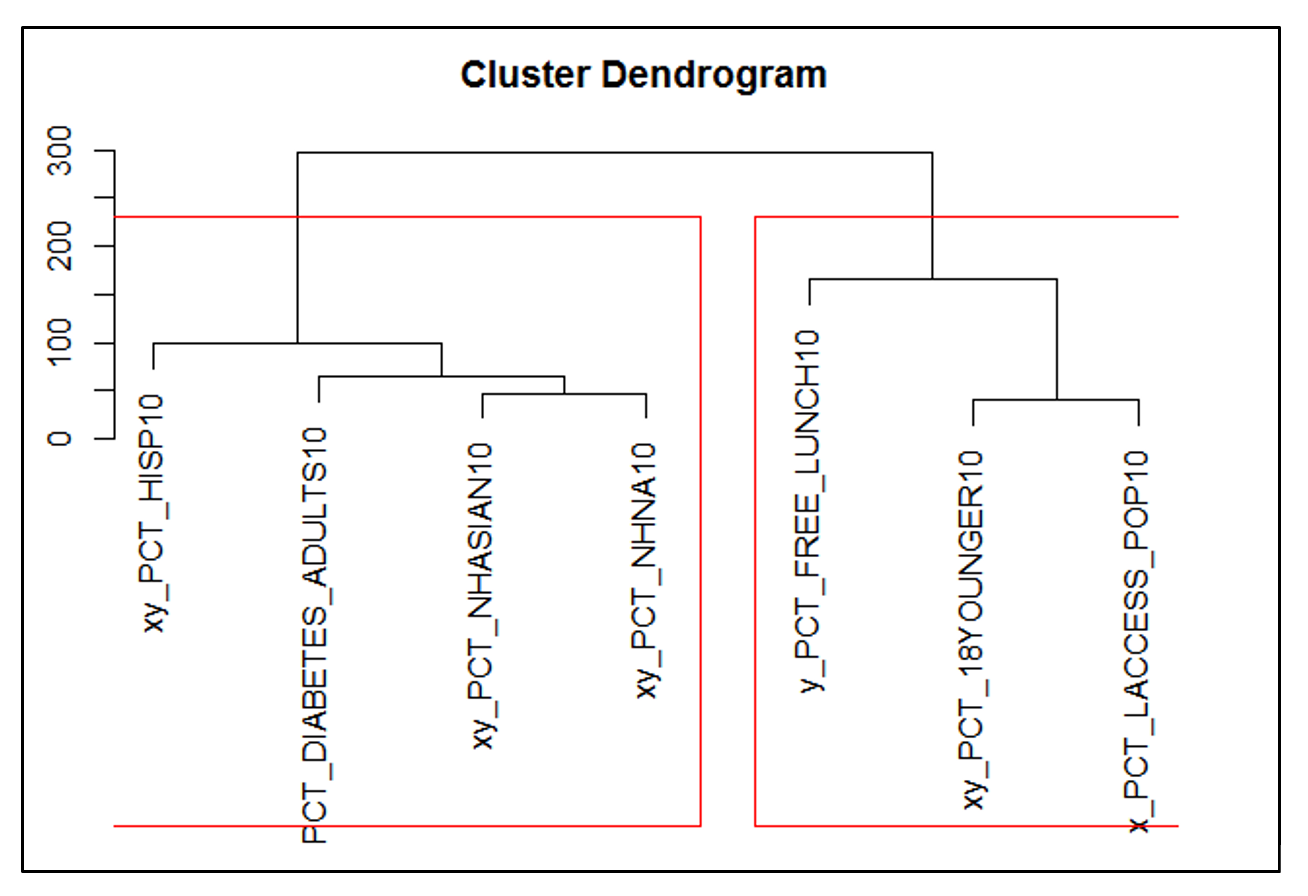
Hierarchical clustering was run both against the states and the independent variables that were used to predict obesity rates. The first cluster illustrates that ethnic demographics + diabetes clustered together. This potentially indicates that diabetes is more related to genetics and ethnic makeup of the population compared to the other variables in the second cluster. For the second cluster, we see that food related variables (% free school lunch + access to stores) + % 18 and younger grouped together. This potentially indicates that the change in youth population impacts access to food and school lunch. Local government might allocated more resources on access to food programs if the population of children is higher in order to maintain a healthy population. When running clustering analysis on the states based on the independent variables (excluding obesity), we saw the states with relatively high obesity rates gathered together in one cluster and states with relatively low obesity rates clustered together, helping confirm that the independent variables are good at determining obesity rates.

Throughout our analysis, areas with low access to healthy food options tend to have higher adult obesity and diabetes rates. For example, in Mississippi counties, many residents are far from supermarkets and supercenters, fast food restaurants are plentiful, and as a result, the state has higher adult obesity and diabetes rates. Policy-makers wanting to improve overall health should consider making healthy food options more accessible to the general population.
Technical summary
Technical Summary
Pre-processing the data
The Food Atlas dataset consists of 3177 observations and 220 variables. The first step in data pre-processing was to compile the dataset into one sheet so we could analyze the variables more easily. The dataset was spread amongst different sheets and so the variables were all compiled in a single table. The second step was to reduce the number of robust variables so that we could extract more meaning from the dataset. We decided to perform feature extraction using Principal Component Analysis (PCA). Our initial approach to PCA was using our entire dataset of 220 variables, but the resulting components were hard to interpret and we needed 64 components to account for 90% of the variance.
Hence, we decided to explore the data by analyzing the variables. We saw that the dataset had variables spread across different years mainly from 2007 to 2014. We identified the variables and the years for which we had record for each variables. We determined the years we would like to focus on and removed those variables that did not fall within those years. Further, we were also able to identify redundancy in the dataset and remove variables that overlapped. This helped us to reduce the variables from 220 to 98 variables. As part of our exploratory analysis, we then looked at the correlation between the 98 variables. The corrplot (See Plot 1 in Appendix Part i) for 98 variables, did not provide much information. Hence we looked at different categories in the data. We examined several corrplots to see how each variables in the categories correlated with variables in other categories. A few of the corrplot (see Plot 2 in Appendix, Part i) showed moderate to strong relationship among variables. Through visualizing the correlation plot and looking at the correlation matrix, we were able to reduce the variable to 55 variables.
Further, to reduce the dataset to a manageable number of variables, we performed PCA over each category. We reviewed the Bartlett test of homogeneity of variances which showed significance for performing PCA. Then we looked at the variables correlations so that that we could remove variables that are either correlated with every variable or not correlated with any variable. For each category, we tested the number of significant correlations at a level of 0.01 for each variable. By looking at the correlations amongst variables in each category, we were able to reduce the overall number of variables by 7. The final reduction by category is as follows: Demographic from 11 to 7 variables; Farms from 8 to 6 variables; and Stores from 6 to 5 variables.
Also, because our variables had different ranges and units, we scaled the data before performing PCA. Our goal for factor selection was find principal components that made up at least 90% of the variance. Additionally, since we used standardized values for each variable we tried to keep factors with deviations greater than 1 (See Plot 3, Appendix Part I). The criteria was surrogating the most relevant variable in each component, measured by the greater loading value in each component. The variables were selected in the same way across each category. If a component had variables that contributed positively or negatively, both the variables were selected. Finally, PCA allowed us to extract 17 variables (See Plot 3, Appendix Part I) – 2 variables were extracted from access, government and stores, and 6 from demographic and 5 from farms. These dataset with 17 variables was used to run models to describe obesity and diabetes in the US.
Regression Analysis Adult Diabetes Rate
One of the two variables of interest was the Adult Diabetes Rate, 2010 from the Food Atlas dataset. In order to analyze the relationship between diabetes rate (response variable) and other independent variables, we used the technique of multiple linear regression to divide our data set into training set (66%) and testing set (34%). The variables used for regression analysis was based on the results from PCA.
As part of the exploratory analysis we looked at the corrplot (see Plot 1 in Appendix, Part II) to visually see if any interesting correlations existed between Adult Diabetes Rate and the independent variables. We saw moderate positive correlation between Adult Diabetes Rate and Household with no car and low access to store, persistent-poverty counties, percent student eligible for free lunch, and a strong positive correlation with adult obesity rate. Other variables such as metro counties, Hispanic and Asian population show weak negative correlations.
We started with the full model as seen below:
MFull = lm(PCT_DIABETES_ADULTS10 ~ PCT_LACCESS_POP10 + PCT_LACCESS_HHNV10 + PCT_NHBLACK10 + PCT_HISP10 + PCT_NHASIAN10 + PCT_NHNA10 + PCT_65OLDER10 + PCT_18YOUNGER10 + PERPOV10 + METRO13 + VEG_ACRESPTH07 + ORCHARD_ACRESPTH07 + BERRY_ACRESPTH07 +GHVEG_SQFTPTH07 +SLHOUSE07 +PCT_FREE_LUNCH10 +REDEMP_WICS12 + CONVSPTH12 + SPECSPTH12 + PCT_OBESE_ADULTS10 + POP10, data=train.FoodNum)
When we fitted the full model using the above-mentioned predictor variables, the output in R program (see Table 1 in Appendix Part II) indicated that PCT_NHNA, PCT_18YOUNGER10, ORCHARD_ACRESPTH07, BERRY_ACRESPTH07 and GHVEG_SQFTPTH07 were not statistically significant variable with p-values > 0.5 for each of the regression coefficients.
Model Selection Procedures
In order to obtain the ‘best’ subset of potential predictors for predicting Adult Diabetes Rate, we utilized the Backward selection procedure using the Akaike’s information criterion (AIC), the Stepwise selection with movement in both directions and the Forward selection method.
As per the Backward selection procedure (see Table 2 in Appendix Part II), the following predictor variables were considered significant: PCT_LACCESS_POP10, PCT_LACCESS_HHNV10, PCT_NHBLACK10, PCT_HISP10, PCT_NHASIAN10, PCT_65OLDER10, PERPOV10, METRO13, VEG_ACRESPTH07, SLHOUSE07, PCT_FREE_LUNCH10, REDEMP_WICS12, CONVSPTH12, SPECSPTH12, PCT_OBESE_ADULTS10 and POP10. Similarly, the output for Forward selection method (see Table 3 in Appendix, Part II) and output for Stepwise selection procedure (see Table 4 in Appendix, Part II) gave the same results seen from Backward selection with identical AIC values.
Evaluation of the Linear Regression Model
To examine how effective the model is, we used the following: Residual Analysis and Outlier Detection, and VIF Scores.
Residual Analysis and Outlier Detection: From the predicted vs. residual plot (see Plot 2 in Appendix, Part II), we checked for linearity and equal variance assumption. As per the predicted vs. residual plot we saw that the points were randomly scattered and the variance was constant indicating homoscedasticity. We saw a few residual points greater than |3| indicating presence of outliers/influential points, especially for those with value greater than |4|. The histogram of the residuals showed fairly normal distribution. However, once again, we saw some extreme values on the right tail. Also as per the Q-Q plot, we saw residual points greater than |3|, indicating outliers. Overall, the points in the Q-Q plot lie on the line, satisfying the assumption of normality. Therefore, we were able to conclude that we did not need to do any transformation or account for non-linearity issues. As per the rstudent vs hat value graph we saw that observations #376 and 520 had a very large studentized deleted residual and so we removed these points from the data and conducted a final regression analysis.
VIF Scores: Based on the VIF score (see Table 5 in Appendix 1, Part ii) we did not see any issue of multicollinearity (all variable had VIF < 5).
Final Linear Regression Model Analysis
Based on the results from the various selection procedure method, we obtained the final fitted linear regression model output from R (see in Table 6 in Appendix, Part II). We were able to produce an R2 = 0.786, meaning 78.6% of the variability in Adult Diabetes rate is explained by the above linear regression model, and adj-R2 = 0.784. In our opinion, the model was good at to determining Adult Diabetes rates. We used the F-test to test the overall utility of the model. We obtained an F-statistic of 476 and a very small p-value. So we were able to reject the null hypothesis, and conclude that at least one independent variable has significant impact on Adult Diabetes rate. Hence, we were able to say that the above model is a good representation of the observed data.
The estimated coefficients βi’s were all significant based on the t-test with p-value less than 0.05.
We also looked at the standardized coefficients. From Table 7 (see Appendix, Part II), we saw that Obesity Rate was the most important variable, followed by Population of 65 years or older, students eligible for free lunch and Black population. In addition, we saw a direct relationship with these variables as well as the categorical variables – poverty counties (1 = persistent-poverty counties, 0 otherwise). Therefore, we could say that counties with high obesity rate, have a greater population older than 65 years of age and higher percent of black population would also have high Adult Diabetes rate. In addition, counties with higher percent of students who are eligible for free lunch will have higher Diabetes rate. Furthermore, counties that are persistently poor will have higher diabetes rate that those counties that are not.
We saw an inverse relationship with variables such as Asian and Hispanic population, number of small slaughterhouses, specialized food store and vegetables acre harvested and counties that were considered metro. Hence, we could say that metro counties, or counties that have higher number of small slaughterhouses, specialized food store and higher number of vegetables acres harvested for sale will reflect lower Adult Diabetes rate. In addition, counties with high percent of Asian and Hispanic Population will also show lower Diabetes rate.
Validation
Finally, we saw how the model performs on the testing data set. For this purpose, we calculated the Mean Absolute Percent Error (MAPE) as it is a measure of prediction accuracy, i.e. it calculates the percent of error found in the testing data set. We obtained the final model in the training set and then used this model in the testing set. We used the “predict.glm” function in R to predict the ‘y’ variable in the testing data that we call “y_pred” and also obtained the actual observed. We then computed the MAPE as we obtained a value of 9.24 (See Table 8 in Appendix 1, Part ii). Therefore, we think that the model does well as a prediction model in the testing dataset.
Lastly, we completed k-fold cross validation technique in which we would choose k = 10. Using the entire dataset we used “cv.lm” function in R (see Table 9 in Appendix 1, Part ii) to calculate the Mean Square on the full model and the final model which contained lower independent variables to compare the values. We obtained mean square error of 1.45 on the full model and 1.44 on the final model. The difference is not that much, yet the mean square error is lower for the final model and so we can say that the final model is a good predictive model.
Regression Analysis For Adult Obesity Rate
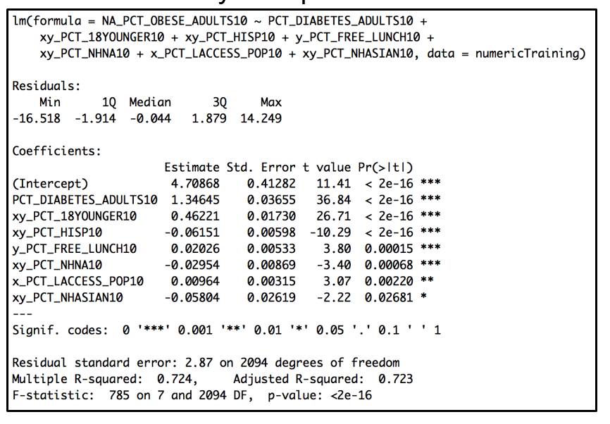
One of our two variables of interest was the Adult Obesity Rate. In order to analyze the relationship between Obesity rates in the US counties and the 17 variables extracted from PCA, we used multiple linear regression technique.We divided our dataset into a training set (66%) and a testing set (34%). We started with a full model, which had many issues. It had many non significant variables and high variance inflation factor values.
Model Selection Procedures
In order to obtain a better model, we used model selection procedures. We performed backward, forward and stepwise selection procedures. We started with backward selection procedure using the Akaike’s information criterion. The backward selection provided 7 variables out of the 17. For both training and testing data the model had significant variables with low variance inflation factors (see Appendix Part II – Table 10 ). Similarly, the output for Forward selection (see Appendix Part II – Table 11) and output for Stepwise selection procedure (see Appendix Part II – Table 12) gave the same results as the Backward selection (see Appendix Part II – Table 13) with identical AIC values. The inclusion of the variables to each model take place at different iterations but all convey into the same model.
Evaluation of the Final Linear Regression Model
The effectiveness of the model was examined through residual analysis, outlier detection, and variance inflation factors (VIF) scores.
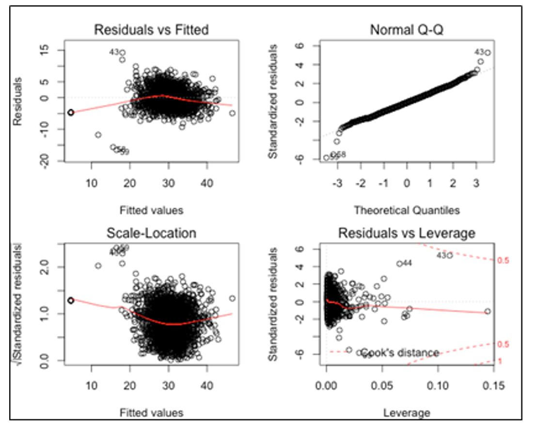
Residual analysis and outlier detection: From the predicted vs. residual plot (see Appendix Part II – Plot 3), we saw that residuals were randomly distributed and the deviation from the zero line was constant across different sections denoting homoscedasticity. By looking at the cook’s distance we noticed few influential points. Additionally in the normal plot, we saw some residual points indicating some outliers, but in the overall pattern the plot presents a fair straight line suggesting normality.
VIF Scores: We did not show any issue with multicollinearity as the maximum VIF score among the selected variables is 2.2. Overall the model looks good in terms of normal residuals with low influential points and all variables being significant.
In conclusion we can say that counties with high percent of Asians and Hispanics tend to have lower adult obesity rates. Also, counties with larger population under 18 years of age have higher adult obesity rates. In addition, counties with higher percent of students who are eligible for free lunch have higher percent of both also has high obesity rate. When we look at the inverse relationship, we see that counties with higher percent of Asian and Hispanic population show lower adult obesity rates.
Canonical Correlation
Because we wanted to examine the relationship between two different sets of variables – health and food access – we used canonical correlation analysis. Canonical correlation allowed us to create linear combinations (i.e. variates) of each of our variable sets; we wanted to find the maximum correlation coefficient between these variates to indicate the strongest relationship between these sets of variables. We did this by carefully choosing the correct variables for each set and using the “cc” command in R. A simple Wilks test showed that for all four canonical correlations for the four health variables, we were able to reject the null hypothesis that the sets of variables are not linearly related with alpha level << 0.05; that is, the first four dimensions must each be significant.
If we look at these canonical correlations more carefully, we were able see some distinct patterns. The first canonical correlation showed general health choice trends with X variate of CONVSPTH12, LACCESS_HHNV10, -FSRPTH12, -SPECSPTH12, -PCT_LOCLFARM07, -FFRPTH12, and Y variate of DIAB, PCT_OBESE_ADULTS10, and –RECFACPTH12. That is, when a county has more convenience stores, more households with low access and no vehicle, fewer full service and fast food restaurants, fewer specialty stores, and fewer local farms, the county also tends to have a higher diabetes and adult obesity rate, and fewer recreational facilities. This correlation relates to food choice; when it is harder to access healthy food, health suffers.
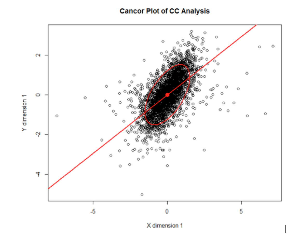
Likewise, for the second canonical correlation, a county with higher access to food (for children, low income, seniors, and in general) and more fast food restaurants, is likely to have a higher child obesity rate and more recreational facilities. That is, more general food access also leads to higher child obesity rates. While this relationship may not be causal, a county or state policy-maker may use this as an incentive to want to increase access to healthy food only, as that may lower diabetes and hopefully obesity rates in their counties. The distribution of records for the X and Y variate is shown below in (Plot 1, Appendix III) the CANCOR plot in R, where the general trend is a positive relationship between the X variate and the Y variate for the canonical correlation. These correlations helped show that many underlying x-variables contributed to rising or lowering the y-variables and it may be useful to consider the specific groups rather than one variable at a time to understand the underlying factors affecting health rates.
Linear Discriminant Analysis Classification
We next tried to use linear discriminant analysis to help classify the categorical variable PERPOV10, which describes whether a county consistently had a poverty rate of at least 20 percent from 1980 through 2011 (value of “1”), or did not (value of “0”). The distribution of this variable is such that only 11.1% of counties qualify for the designation of ‘persistent poverty county’. A quick linear discriminant analysis on a training set of 2096 randomly sampled counties yielded a prediction model, which was tested on the remaining 1081 counties. The R code to reproduce the results is in the appendix (Part V). We generated the misclassification matrix, presented below (see Plot 2, Appendix III).
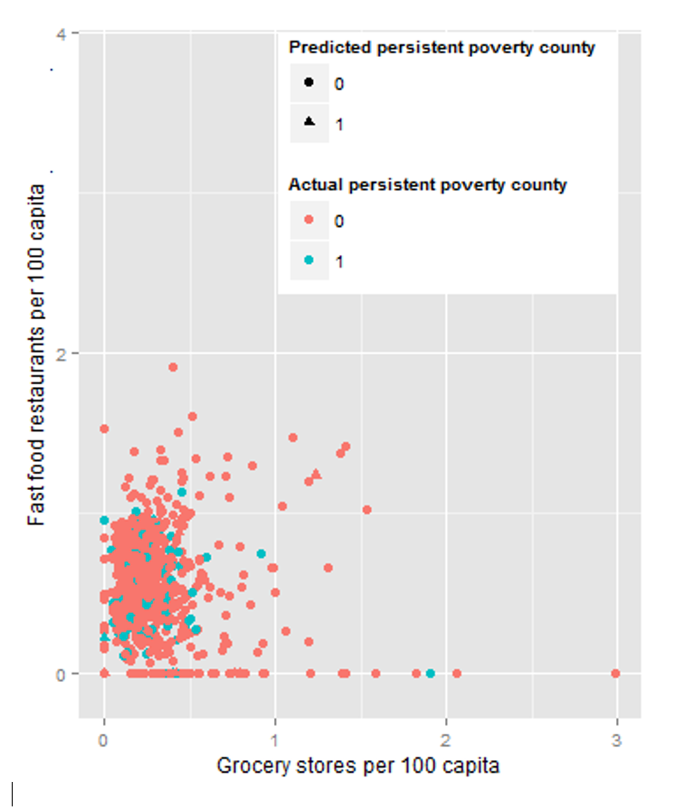
At first glance, the 87.8% overall accuracy appears to be an amazing result, but if we look at the total number of ‘1’s (persistent poverty counties), only 26 out of 133 counties were classified correctly. It seems like these variables were able to predict non-persistent-poverty counties accurately and may be valuable for that purpose, but is not a good model for predicting persistent-poverty counties accurately. A plot of two of the most significant variables colored by predicted class is in see Plot 3, Appendix III. Restricting the model to only use the six most significant variables in the original model (GROCPTH12, SUPERCPTH12, CONVSPTH12, LOCLFARM07, FFRPTH12, and SPECSPTH12) results in worse accuracy and much worse ability to predict persistent-poverty counties accurately. We encountered related results with the Metro variable (is the county a Metro area (“1”) or not (“0”) and decided not to investigate categorical variables in too much detail in this analysis.
Cluster Analysis
To understand relationships of our data better and to validate some of our technique conclusions we had drawn from our previous analysis, we had decided to also perform clustering analysis against our data. The variables that were included were those that were most predictive of obesity rates: % free school lunch, % Asian, % 18 and younger, % Native American, % Hispanic, % Access to food/ stores, and % diabetes rates. We had also aggregated our county level details up to state level so that we could get a global overview of our data (3100 rows to 51 rows).
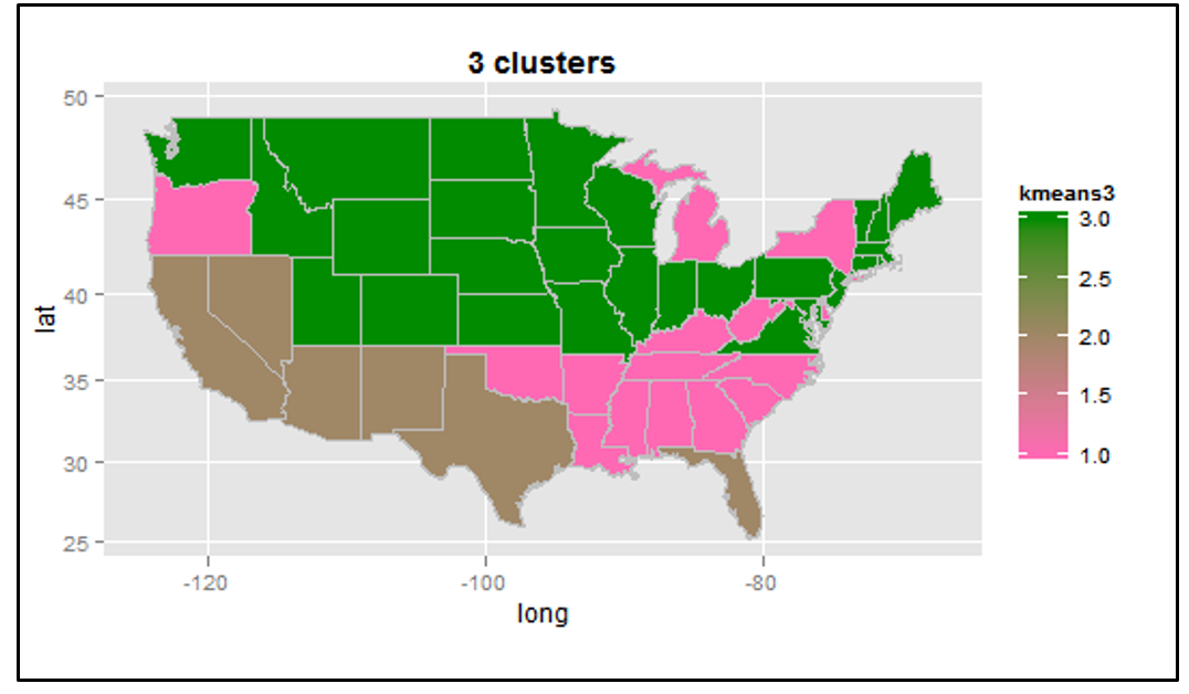
The first technique we had applied to our data was k-means clustering. We ran k-means function with 2-5 specific clusters (Plot 1, Appendix Part IV). In the plot with 4 clusters, we saw that certain variables showed more distinction across the states compared to others. For example based on the plot, we saw that the data points for % free school lunch variable and % Hispanic separated relatively well. After applying the pam algorithm (Partition Around Medoids), we saw that 2 clusters provided the best results. The silhouette plot (Plot 2, Appendix Part IV) illustrated how each observation fit into the cluster it had been assigned to. The more values that are close to one, the better the fit is. The average silhouette for these two clusters was 0.58, which is somewhat within reasonable range. Cluster 2, with only 9 variables showed a relatively low value width as some of the variables were in the negative range. However the silhouette plot for the 3 clusters showed relatively standard widths but the total average width was slightly lower (0.51) (Plot 3, Appendix Part IV) . For both 2 and 3 k means clustering, maps were created to visualize the results, however the groupings were not very clear (Plot 4,5, Appendix Part IV).
Hierarchical clustering was applied to our dataset. First we ran the hclust() function against the 8 independent variables and saw that in the first cluster, ethnic demographics (% Asian, % Hispanic, %Native American) + % population with diabetes grouped together and for the second cluster, we saw that food related variables (% free school lunch + access to food) + % 18 year and younger grouped together. (Plot 6, Appendix Part IV) This could indicate that diabetes is more related to genetics/ ethnic makeup compared with the other variables found in the second cluster. For the second cluster, perhaps the change in population of children impacts access to food and school lunch more so than characteristics in the first cluster. Potentially this could indicate that the higher the % population of children, the more focus and resources the local government would place on these areas in order to ensure that their population is healthy.
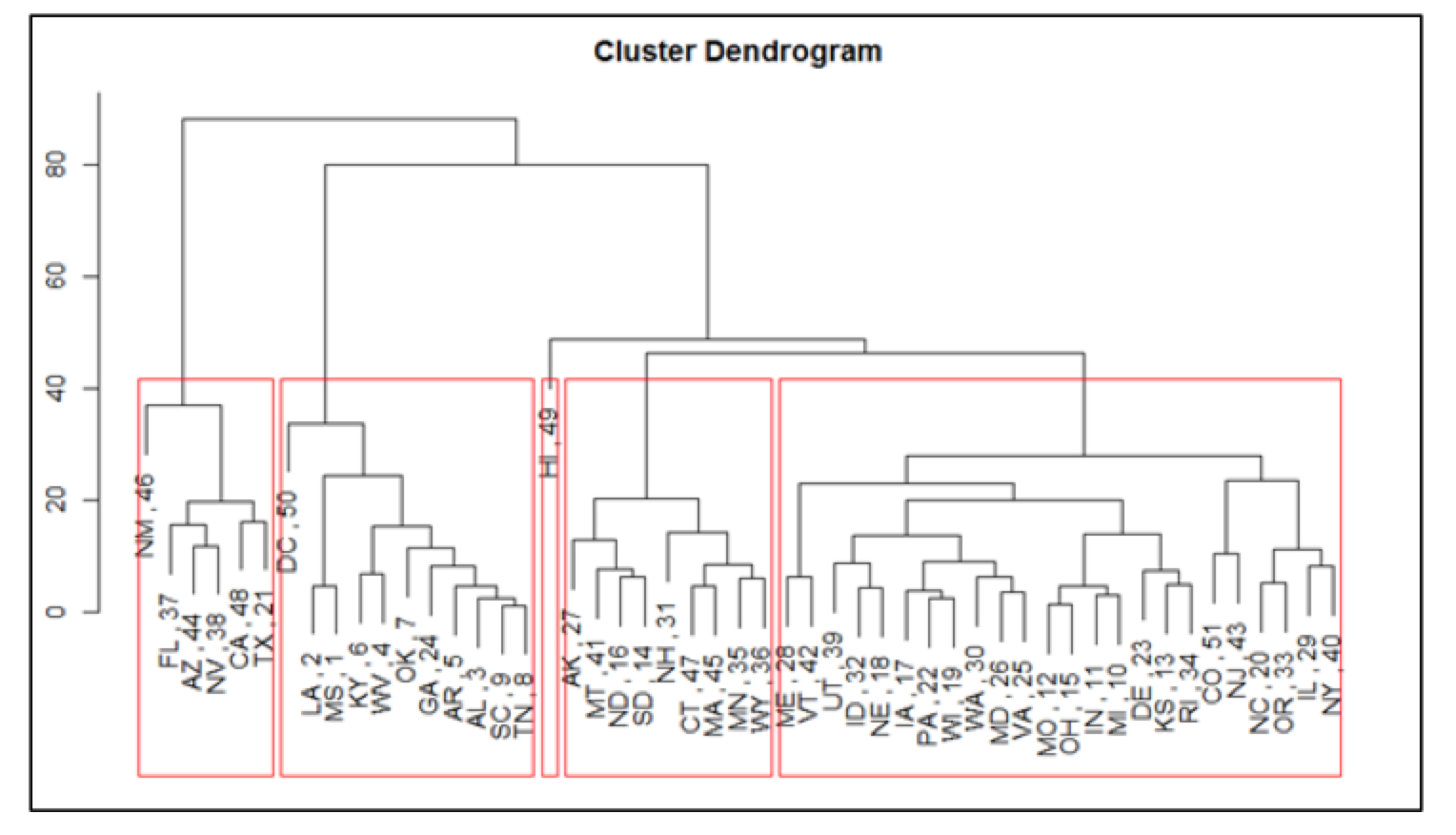
We also wanted to run hierarchical clustering against the states. We ran the hclust() function against the states and the obesity rates. Obviously the cluster dendogram would show high obesity rates grouped together, low obesity rates together and middle obesity rates together (Plot 7, Appendix Part IV – the leaves represent the states, the number refers to the rank based on obesity rate (1 = highest obesity rate)). We then ran the hclust() function against the states using the independent variables (without obesity rates) because we wanted to see how well these variables related to obesity rates. The results showed a relatively good relationship amongst the clusters. We saw the states with relatively high obesity rates gathered together in one cluster and states with relatively low obesity rates clustered together (Plot 8, Appendix Part IV). The height of each branch showed us how different each group was from another. We could clearly see this relationships between the states with the higher obesity rates and the states with the lower obesity rates.
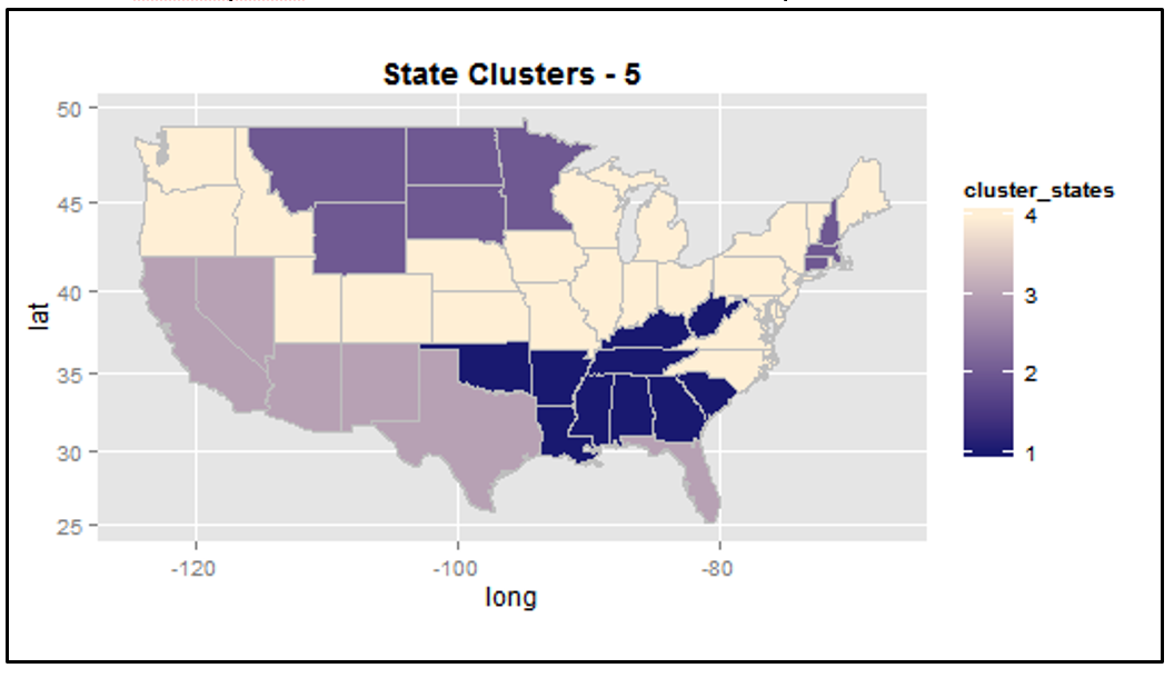
Choropleths of the raw obesity rates, the obesity rate clusters, and state clusters were created for additional visual comparisons. Map #1 (Plot 9, Appendix Part IV) represented the states and their raw obesity rates. Clearly the higher the obesity rate, the more red the area would be. Map #2 (Plot 10, Appendix Part IV) showed how the states clustered together based on these raw obesity rates (the continuous color gradation does not mean really anything- focus on the segments). The dark purple cluster represented the states with the highest obesity rates (Southwest) while the mid color purple segment (West coast and North east) represented states with the lowest obesity rates. Map #3 (Plot 11, Appendix Part IV) conveyed how well our independent variables (excluding obesity rate) clustered our states together. The Southwest states with high obesity rates clustered together as well as the West Coast states, which have lower obesity rates. Overall, this clustering process helped confirm that the chosen variables from regression and PCA were somewhat good at categorizing obesity rates (keeping in mind the R^2 for our obesity regression model was around 72%). The analysis also showed some obesity ranges (especially the extremes) were easier to predict than others (i/e Southwest/ West Coast).
Conclusion
Throughout our analysis, our main conclusion is that low access to food is related to both diabetes and obesity rates in a county. Regression analysis, canonical correlation analysis, and clustering supported this result. From our regression analysis, counties with low access to stores also tend to have higher obesity and diabetes rates. Counties that have a large population of age 65 or older also tend to have higher diabetes rates – which matches our real-world perception that the elderly tend to have diabetes more often. We also noticed counties that have a higher percentage of students eligible for free lunch also tend to show higher obesity and diabetes rates. These students are most likely from low-income families and live in counties that have low access to stores and healthy food.
Clustering helped confirm that the variables we selected to predict obesity rates were good predictors. We had also discovered that, within the obesity independent variable set, % diabetes tends to be related with genetics and ethnic makeup of the population. The variable % population 18 and younger looked to be related to food related variables (% access to stores and % access to free school lunch) indicating that perhaps that resource allocation may be influenced by how old or young the population is.
We also noticed with our canonical correlation analysis that the variables corresponding to low access to healthy food (convenience stores, lack of restaurants and farms, no vehicle) tended to be high in the same counties that have a higher rate of both diabetes and obesity. That is, many counties tend to have health problems if they cannot access healthy food options. On the other hand, counties with high access and lots of fast food restaurants tend to have high childhood obesity rates.
In conclusion, we can use these results practically to advise a decision-making body in where to concentrate their resources on in terms of money and support. If the goal of a policy-maker is to lower the obesity rate or diabetes rate, then they should implement policies to support healthy living and better food access – build grocery stores, supermarkets, etc. that provide healthier food options to the population in counties with low access to healthy food choices


